In This Article
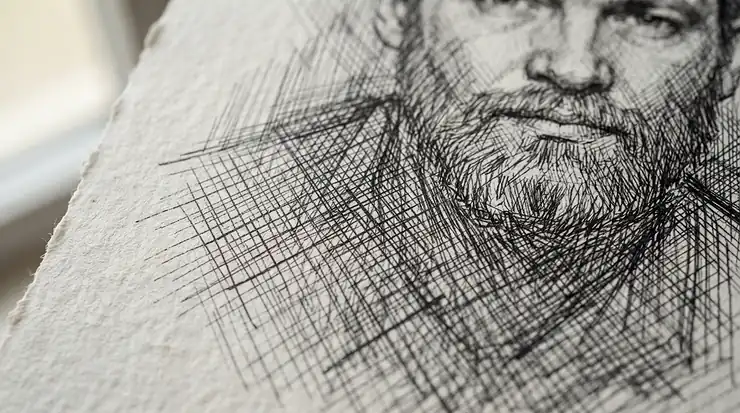
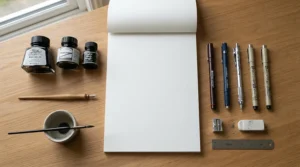
Here’s a confession most art tutorials won’t make: the pen matters less than you think. Buy the fanciest technical pen on the market, load it with the richest sumi ink you can find, and then draw on the wrong surface — and you’ll still end up with fuzzy, bleeding, disappointing lines. bristol board for ink drawing exists precisely because ink is unforgiving, and paper is not neutral ground. Bristol board is a stiff, multi-ply drawing surface — named not after the city of Bristol but after Frederick Hervey, the 4th Earl of Bristol, a prolific art collector — engineered with a sealed, hot-pressed surface that keeps fluid media sitting on top of the fibres rather than sinking into them. That’s the whole point: a nib should glide, not skid, and a line should stay crisp from the first stroke to the fortieth. This guide walks through seven genuinely good options currently sold on amazon.co.uk, from budget classroom pads to archival-grade premium boards, and unpacks exactly why the surface you choose changes what your pen can do.
Quick Comparison: Best Bristol Board for Ink Drawing at a Glance
Before the deep dive, here’s the shortlist. Every product below is discussed in full further down, with pros, cons, and honest analysis of who each one actually suits.
| Product | Finish | Weight | Best For |
|---|---|---|---|
| Seawhite of Brighton A3 Bristol Board Pad | Smooth | 240gsm | Budget-conscious beginners |
| Canson Graduate Bristol | Very smooth | 180gsm | Students and casual practice |
| Canson XL Series Bristol | Smooth | 180gsm | Everyday marker-and-ink combo work |
| Daler-Rowney Graphic Series Bristol Board | Smooth | 250gsm | UK-brand illustration and studio use |
| Strathmore 300 Series Bristol Paper | Smooth or vellum | 270gsm | Fine hatching and detailed linework |
| Strathmore 400 Series Bristol Paper | Smooth or vellum | 2-ply, heavyweight | Finished, exhibition-ready ink pieces |
| Hahnemuhle Bristol Board | Ultra-smooth | 250gsm | Technical pen and fineliner precision |
Reading across this table, a pattern emerges fast: weight and finish do most of the heavy lifting, and price tends to track how consistently a mill controls both. The lighter, 180gsm options are perfectly serviceable for practice sketches and looser linework, but anyone pushing into cross-hatching or wet brush-pen ink will feel the difference the moment a heavier, better-sized sheet is under the nib. None of these are bad choices — they’re just built for different stages of the same journey.
Found a favourite already? Bookmark this page and come back before you check out — the comparisons below might change your mind.
Top 7 Bristol Board for Ink Drawing: Expert Analysis
1. Seawhite of Brighton A3 Bristol Board Pad — best budget UK-made option
Seawhite is a Sussex-based paper company, and this pad is proof that “cheap” and “cheerfully made in Britain” aren’t mutually exclusive. The 240gsm sheets carry a genuinely smooth, white surface bonded to a stiff two-millimetre grey backing board, so even the loose top sheet in the pad stays flat while you work — no clipboard required. That weight sits comfortably in Bristol board territory (the format is traditionally rated by grammage or ply rather than a single number, and 220-250 g/m² is the conventional European range), which means it resists cockling under a moderately wet brush pen, though a saturated ink wash will still test its limits.
Realistically, this is the pad you hand to a nervous beginner, or the one you buy in bulk for warm-up sketches before committing a “keeper” idea to something pricier. Because it’s a smaller, regional manufacturer rather than a mass-market giant, verified customer review volume on Amazon is thinner than for the big names — worth flagging honestly rather than inventing sentiment that isn’t there.
What UK buyers do consistently mention is the sturdy backing board and the fact it arrives flat, not creased. If you’re just working out whether you even enjoy pen-and-ink drawing before spending real money, start here.
Pros:
- ✅ Genuinely UK-manufactured, supporting a smaller paper mill
- ✅ Rigid backing board means no desk or drawing board needed
- ✅ Smooth surface handles fineliners and dip pens confidently
Cons:
- ❌ Thinner review pool than the major international brands
- ❌ Not rated for heavy ink wash or repeated wet media layering
Expect this pad to sit at the lower end of the price spectrum, generally under £15 for an A3 pad — solid value if you’re testing the waters rather than framing the results.

2. Canson Graduate Bristol — best entry point for regular practice
Canson’s Graduate range exists for exactly one reason: to give students and hobbyists a genuinely smooth bristol surface without the price tag of the brand’s professional lines. At 180gsm, it’s the lightest board on this list, and that matters practically — thinner paper means more sheets per pad for the same shelf space, which is precisely what you want when you’re doing fifty quick figure studies rather than one finished illustration. The bright white base gives ink strong contrast straight off the bat, and the very smooth finish is specifically engineered for pen and ink and marker techniques rather than pencil or pastel.
What most buyers overlook about a paper this light is that “smooth” and “thick” are two separate qualities entirely — this sheet can still feel a touch flexible under a heavy hand, and won’t take an aggressive wash the way its 250-270gsm siblings further down this list will. Aggregated feedback on this range tends to praise the reliable whiteness and the pad’s tidy glued binding, while some reviewers note that very wet brush pens can cause slight rippling on single sheets. That’s not a flaw so much as a reminder of what 180gsm paper is and isn’t built for.
Pros:
- ✅ Very affordable per sheet for regular daily practice
- ✅ Bright white base maximises ink-to-paper contrast
- ✅ Available in A5, A4 and A3, so it scales with your desk
Cons:
- ❌ Can ripple slightly under heavy ink wash
- ❌ Lighter weight than most dedicated ink-drawing bristols
At around £5-£9 depending on pad size, this is genuinely one of the cheapest ways to build a daily ink-drawing habit without feeling wasteful about “wrong” pages.
3. Canson XL Series Bristol — best all-rounder for markers and ink together
If Graduate is Canson’s student line, XL Series Bristol is the step up for anyone who’s decided pen and ink is a keeper hobby, not a phase. It shares the 180gsm-equivalent smoothness that suits fine lines, but the XL range is specifically marketed at combined marker-and-ink work, and that dual-purpose engineering shows in how it handles alcohol-based markers without excessive bleed-through — a genuine headache on cheaper stock. Spiral and fold-over binding options mean you can lay the pad flat on a desk, which sounds trivial until you’re three hours into a detailed piece and the spine keeps fighting your wrist.
Based on the spec comparison with Graduate, XL’s slightly heavier construction and dedicated ink-and-marker rating make it the more forgiving option if your workflow mixes fineliner outlines with marker or copic-style rendering — a very common combination among illustrators and comic artists. Reviewers consistently mention the “extra white” surface tone as noticeably brighter than typical cartridge paper, which does genuinely make black ink linework pop.
Pros:
- ✅ Handles alcohol markers with minimal strike-through
- ✅ Spiral-bound options lie flat for long working sessions
- ✅ Extra-white surface boosts contrast for finished line art
Cons:
- ❌ Slightly pricier per sheet than the Graduate line
- ❌ Spiral binding can catch a trailing hand on left-bound pads
Pricing generally sits in the £8-£13 range for a 25-50 sheet pad depending on size, which is a fair mid-tier jump from pure student stock.
4. Daler-Rowney Graphic Series Bristol Board — best British heritage brand for illustration
Daler-Rowney has been supplying British art students and professionals since the 19th century, and its Graphic Series bristol board is aimed squarely at technical illustration, comic art, and pen work. At 250gsm, it’s noticeably more substantial in the hand than the Canson entries above, with a glued-one-side pad construction that keeps the working sheet stable. What the spec sheet won’t tell you, but the format tells you plainly, is that this heavier weight buys real headroom: you can layer cross-hatching, go back over lines with a slightly wetter nib, and even introduce a light ink wash without the sheet cockling the way 180gsm paper would.
This is a board built for people who’ve already decided ink is their medium and want a UK-manufactured option with decades of institutional trust behind it — many British art foundation courses have used Daler-Rowney stock for exactly this reason. Aggregated review sentiment for the Graphic Series consistently highlights its dependable smoothness for fine detail work, with occasional notes that the sheets are individually glued rather than perforated, so careful removal matters if you want clean edges.
Pros:
- ✅ Heavier 250gsm stock handles layered hatching confidently
- ✅ Long-established British brand with institutional pedigree
- ✅ Acid-free construction suited to finished, kept artwork
Cons:
- ❌ Glued single-side binding needs careful sheet removal
- ❌ Costs more per sheet than the lighter Canson options
At roughly £10-£16 for an A3 pad, it sits in the middle of this line-up — a sensible next step once you know you’re sticking with pen and ink long-term.
5. Strathmore 300 Series Bristol Paper — best mid-range for fine hatching
Strathmore is the paper brand most American illustration schools default to, and its 300 Series Bristol is the workhorse that made that reputation. It’s rated 100lb (roughly 270gsm), sold in both smooth and vellum finishes, and — crucially for anyone doing detailed cross-hatching — described by Strathmore itself as a single-ply, board-weight sheet with the caliper of a two-ply bristol, meaning you get the rigidity of a heavier board without the extra thickness sometimes making sheets awkward to scan or store. On paper this means (pun intended) you’re getting close to premium heft at a mid-range price point.
The smooth finish is the one to pick for pen and ink specifically; the vellum finish has more tooth and suits graphite, charcoal, and pastel better, so don’t grab the wrong pad by mistake if inking is your priority. Reviewers on Amazon and specialist retailers alike consistently single out the smooth variant’s ability to hold crisp, feather-free lines even with slightly wetter nibs — a direct result of the surface sizing discussed later in this guide.
Pros:
- ✅ Board-weight rigidity from a single-ply sheet
- ✅ Smooth finish specifically excels at fine pen-and-ink line work
- ✅ Widely stocked, so restocking your favourite size is easy
Cons:
- ❌ Vellum and smooth finishes look similar — easy to order the wrong one
- ❌ Not the cheapest option if you’re still experimenting
Expect to pay somewhere in the £12-£20 bracket depending on pad size, positioning this firmly as a “you’ve committed to the craft” purchase.
6. Strathmore 400 Series Bristol Paper — best premium two-ply for finished pieces
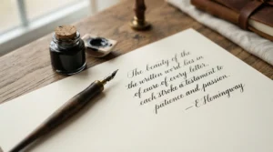
Step up again and you land on Strathmore’s 400 Series — genuine two-ply construction, meaning two full sheets of paper are laminated together during manufacture for extra body and a satisfying weight in the hand. Strathmore’s own guidance is refreshingly specific here: the smooth finish is excellent for fine line drawings using pen and ink or marker, while the vellum finish suits pencil, pastel, airbrush and mixed media better. That distinction is worth repeating because it’s the single most common mistake buyers make with this range — grabbing vellum for inkwork because it “sounds fancier,” when smooth is the correct call for a crisp technical line.
Here’s what to weigh: the 2-ply construction gives enough tooth-free rigidity that finished illustrations can be scanned, framed, or sold without a backing board, which matters if you’re building a portfolio or selling originals. This is squarely a professional-tier product, and the price reflects it, but for anyone producing final artwork rather than practice sketches, the difference in surface consistency compared with 180gsm student paper is immediately visible under a loupe or a good macro photograph.
Pros:
- ✅ True 2-ply construction gives exhibition-ready rigidity
- ✅ Smooth finish is purpose-built for crisp fine-line ink work
- ✅ Trusted by professional illustrators for finished pieces
Cons:
- ❌ Meaningfully pricier per sheet than the 300 Series
- ❌ Not recommended for traditional watercolour techniques
Pricing typically lands around £16-£24 for a smaller pad, which is a genuine premium — justified if you’re producing pieces you intend to keep, sell, or frame.
7. Hahnemuhle Bristol Board — smoothest German-engineered surface for technical pen work
Hahnemuhle has been making paper in Germany since 1584, and while that heritage is a nice bit of trivia, what actually matters here is the engineering: this 250gsm board uses double-sizing on both sides, giving it one of the most consistently glass-smooth surfaces in this entire line-up. The manufacturer’s own specification confirms it’s suitable for pencil, Indian ink, pen, fineliner, airbrush and acrylic marker, and is smooth on both sides, acid and lignin free, age resistant and erasure resistant.
Double-sided smoothness is the standout feature worth dwelling on — most bristol boards in this guide are optimised on one face only, but Hahnemuhle’s approach means you could theoretically work both sides of a sheet without one side performing noticeably worse, useful for double-sided studies or when paper economy matters. Based on the spec comparison with the Strathmore boards, Hahnemuhle’s slightly lower gsm (250 versus 400 Series’ heavier 2-ply build) is offset by its exceptional sizing, which keeps even fountain-pen-style wet ink from feathering. This is the board technical illustrators and architecture students tend to reach for when precision, not texture, is the entire point.
Pros:
- ✅ Double-sided sizing allows genuine two-sided working
- ✅ Exceptional resistance to ink feathering, even with wetter nibs
- ✅ Acid-free and age-resistant for archival-quality finished work
Cons:
- ❌ Premium pricing compared with UK-made budget alternatives
- ❌ Ultra-smooth surface offers zero tooth for anyone wanting texture
Prices generally sit in the £9-£15 range for a 20-sheet A4 pad, making it surprisingly accessible for the quality on offer, particularly if your work leans toward fine, controlled linework over expressive, textured mark-making.
Top 7 Bristol Board for Ink Drawing: Full Comparison
| Product | Weight/Ply | Finish | Best For |
|---|---|---|---|
| Seawhite of Brighton A3 Bristol Board Pad | 240gsm, rigid backing | Smooth | First-time buyers on a tight budget |
| Canson Graduate Bristol | 180gsm | Very smooth | High-volume daily practice |
| Canson XL Series Bristol | 180gsm-equivalent | Smooth | Combined ink and marker work |
| Daler-Rowney Graphic Series Bristol Board | 250gsm | Smooth | Illustration students, UK heritage brand |
| Strathmore 300 Series Bristol Paper | 100lb/270gsm, board-weight | Smooth or vellum | Detailed hatching and linework |
| Strathmore 400 Series Bristol Paper | 2-ply, heavyweight | Smooth or vellum | Finished, portfolio-ready ink pieces |
| Hahnemuhle Bristol Board | 250gsm, double-sized | Ultra-smooth | Technical pen precision, both-sided use |
Looking at the full spread, weight and price rise together in an almost straight line, but “best” genuinely depends on what stage you’re at. Budget-conscious beginners get real value from Seawhite of Brighton A3 Bristol Board Pad and Canson Graduate Bristol, since neither compromises on the smooth surface that ink actually needs — they just offer less thickness headroom for wet, layered work. Meanwhile, anyone producing finished, sellable, or exhibition-bound pieces should weight their decision toward Strathmore 400 Series Bristol Paper or Hahnemuhle Bristol Board, where the extra cost buys measurably better resistance to feathering and cockling under sustained ink work.
Bristol Board vs Cartridge Paper: What’s Actually Different
This is the comparison every beginner should read before spending a penny, because “drawing paper” is not one thing — and the confusion between bristol board and standard cartridge paper causes more disappointing first attempts at ink drawing than almost any other buying mistake.
Cartridge paper is the general-purpose drawing paper found in most school sketchbooks: moderately textured, single-ply, and manufactured primarily with pencil, charcoal, and light washes in mind. Bristol board, by contrast, is a purpose-built, multi-ply or board-weight sheet with a hot-pressed, heavily sized surface engineered specifically to resist fluid absorption. The practical consequence is stark: draw the same fineliner line on standard cartridge paper and on bristol board, and the cartridge paper line will often show soft, slightly furred edges within seconds, while the bristol board line stays crisp and self-contained.
| Feature | Bristol Board | Cartridge Paper |
|---|---|---|
| Surface | Smooth, hot-pressed, heavily sized | Lightly textured, moderate sizing |
| Best For | Pen and ink, technical linework, marker | Pencil, charcoal, light wash, general sketching |
| Ink Feathering Risk | Low | Moderate to high |
| Rigidity | Stiff, often multi-ply | Single-ply, more flexible |
The analysis here is straightforward: if your primary tool is a nib, fineliner, or dip pen, cartridge paper is genuinely the wrong substrate, not just a lesser one. It isn’t that cartridge paper is bad paper — it’s simply optimised for a different job, the way a good bread knife is a poor choice for filleting fish. Cost-per-use also tilts in bristol board’s favour for finished ink work, because reworking a feathered, ruined cartridge-paper drawing wastes both the sheet and your time, whereas a slightly pricier bristol sheet that works first time is the cheaper option in practice.
Practical Usage Guide: Setting Up Your Bristol Board for Ink Work
Buying the right board is only half the job — how you prepare and handle it changes results almost as much as the paper itself.
Start by acclimatising your pad. Bristol board that’s been sitting in a cold delivery van and is then brought into a warm, dry studio can pick up subtle moisture from the air before you’ve even opened the packaging; leaving it flat, unwrapped, for a couple of hours before use lets it settle and reduces the odds of unexpected cockling on your first sheet. When you do start, always test your specific ink-and-nib combination on an offcut or the pad’s inside cover first — even within one brand’s range, smooth and vellum finishes react differently, and a wetter fountain-pen-style ink behaves nothing like a dry technical fineliner.
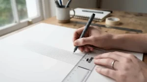
Work from a slight incline rather than flat on the desk if you’re using a dip pen or brush, since gravity helps prevent ink pooling in low spots on the sheet. For maintenance between sessions, store finished and unused sheets flat, away from direct sunlight and humidity — even acid-free, archival boards will yellow faster in a damp shed than a dry drawer. A common first-30-days mistake is pressing too hard with a fineliner out of habit from writing on regular paper; bristol board’s smoothness means the nib needs far less pressure to lay down ink evenly, and heavy-handed technique on a premium sheet like the Strathmore 400 Series Bristol Paper can actually compress the fibres and cause subtle indentation you’ll only notice once the ink’s dry.
Real-World Scenarios: Matching the Board to the Artist
Specs only mean something once you translate them into your own working life, so here are three honest profiles.
The comic-book hobbyist on a student budget, drawing panels most evenings after class with a basic fineliner and the occasional grey marker for shading. Their priority is volume over archival permanence — they’ll get through dozens of sheets a month. The Canson Graduate Bristol or Canson XL Series Bristol suit this pattern perfectly: affordable enough to fill sketchbooks without guilt, smooth enough that lines stay clean, and the XL range’s marker compatibility covers the shading step too.
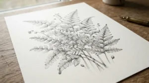
The botanical illustrator working toward a small exhibition, spending eight to ten hours per finished piece with fine dip-pen linework and occasional wash. Here, cost-per-sheet matters far less than consistency and archival quality across a series of pieces meant to hang together. Strathmore 400 Series Bristol Paper or Hahnemuhle Bristol Board are the sensible picks — the rigidity and acid-free construction mean framed pieces will hold their appearance for years, not fade or yellow within a season.
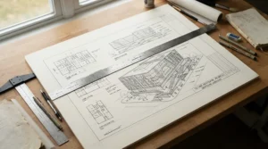
The architecture student doing technical pen renderings for coursework, working under deadline pressure with rulers, technical pens, and repeated fine parallel lines. Precision and feathering-resistance under a consistent hand pressure matter more than anything. Hahnemuhle Bristol Board‘s double-sided sizing and Strathmore 300 Series Bristol Paper‘s board-weight rigidity both suit this scenario, giving crisp results whether the drawing is inked in one long session or over several returns to the same sheet.
Problem → Solution: Fixing Common Bristol Board Ink Issues
Even good paper choices go wrong without the right technique. Here are the five problems that come up most often, with practical fixes.
Problem: Ink feathers along the line edges. This usually means either the paper’s sizing is too light for how wet your ink or nib is, or you’re pressing too hard and forcing extra ink into the fibres. Solution: switch to a smooth-finish board like Strathmore 300 Series Bristol Paper or Hahnemuhle Bristol Board, and ease off pressure — let the nib do the work.
Problem: The sheet buckles or cockles after a wash. Lighter boards like Canson Graduate Bristol at 180gsm simply have less mass to absorb moisture without warping. Solution: for any wash-heavy technique, size up to at least 250gsm, such as Daler-Rowney Graphic Series Bristol Board.
Problem: Marker bleeds through to the sheet underneath. Alcohol-based markers are notoriously aggressive on thin paper. Solution: use a dedicated marker-and-ink board like Canson XL Series Bristol, and always keep a scrap sheet behind your working page.
Problem: You bought vellum finish by mistake and lines look fuzzy under magnification. Vellum’s texture is designed for pencil and pastel, not fine ink lines. Solution: return to smooth finish specifically — double-check the pad label before ordering your next batch.
Problem: Finished pieces yellow or become brittle over time. This points to acidic paper stock. Solution: choose boards explicitly marketed as acid-free, such as Hahnemuhle Bristol Board or Strathmore 400 Series Bristol Paper, both built with long-term stability in mind.
How to Choose Bristol Board for Ink Drawing
Cutting through the marketing noise, here’s a genuinely useful decision process:
- Identify your ink type first. Wet, saturated inks (brush pens, dip pens with fountain-style ink) need heavier, more heavily sized paper than dry technical fineliners.
- Check the finish, not just the brand. Smooth is correct for pen and ink; vellum is for pencil, pastel, and charcoal. This single detail causes more disappointment than any other spec.
- Match weight to technique. Light washes or layered hatching need at least 250gsm; simple linework can get by on 180gsm.
- Consider ply construction for finished work. Single-ply boards are fine for practice; 2-ply boards like the Strathmore 400 Series Bristol Paper suit pieces you intend to frame or sell.
- Factor in acid-free status if longevity matters. Sketches you’ll discard don’t need it; portfolio pieces absolutely do.
- Buy a small pad before committing to a large one. Even within a trusted brand, finishes vary — test first.
- Budget per sheet, not per pad. A pricier pad with more usable sheets can be cheaper per drawing than a bargain pad you have to redo constantly.
Smooth vs Vellum Finish: Features That Actually Matter
Every bristol board buyer eventually hits this fork in the road, and it’s worth being blunt about it: for ink drawing specifically, smooth finish wins in almost every scenario, and vellum finish is a trap for anyone who assumes “more texture equals more quality.” Smooth bristol is hot-pressed to minimise tooth, which means a pen nib glides with minimal friction and ink sits cleanly on the surface rather than catching on fibre peaks. Vellum finish, by contrast, retains a light texture specifically because it’s designed to grip graphite, charcoal, and pastel — media that need some surface bite to deposit pigment evenly.
What most buyers overlook is that this isn’t a quality hierarchy at all — it’s a specialisation. A vellum-finish sheet isn’t a lesser bristol board; it’s the wrong tool for a pen, in the same way a smooth board would frustrate a charcoal artist chasing rich, textured shading. If you only ever work in ink, buy smooth every time and don’t be tempted by vellum’s slightly more “premium” feel in the hand. If you occasionally mix media — say, graphite underdrawing finished in ink — a smooth-finish board still tends to be the safer universal choice, since most fine technical pens perform poorly on textured vellum regardless of how light the graphite layer beneath it is.
Understanding Ink Feathering: Why It Happens and How Sizing Prevents It
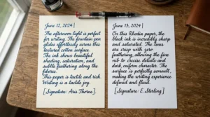
Feathering is the single most common complaint among newcomers to pen and ink, and it has a precise technical explanation rather than being random bad luck. Paper fibres are naturally absorbent; without treatment, ink would simply wick sideways along those fibres the moment it touched the sheet, creating soft, spidery, uncontrolled edges instead of a crisp line. Manufacturers counter this with sizing — a treatment applied during papermaking, historically using starch and later rosin compounds, that reduces the paper’s water absorbency and controls how printing inks and other liquids interact with the surface. Bristol board’s entire reputation for crisp linework comes down to how thoroughly and evenly this sizing is applied, both internally in the pulp and as a surface coating.
Several factors combine to cause feathering even on paper that should resist it: excessively wet ink, an overly broad or saturated nib, heavy hand pressure forcing ink deeper into the fibres, and — very commonly — using the wrong finish, since vellum’s textured surface offers more fibre exposure than a hot-pressed smooth sheet. The fix is rarely about buying an entirely different, more expensive paper; it’s usually about matching finish to technique correctly, testing your specific ink on an offcut first, and using a lighter touch than instinct suggests. Boards like Hahnemuhle Bristol Board, with double-sided sizing, are specifically engineered to give a wider margin for error here, which is exactly why technical illustrators lean on them under deadline pressure.
Common Mistakes When Buying Bristol Board for Ink Drawing
Even experienced hobbyists trip over the same handful of buying errors repeatedly. First, ordering vellum finish because the name sounds more premium, when smooth is almost always correct for inkwork. Second, choosing the cheapest available pad without checking gsm, then blaming the ink or pen when 150-180gsm paper buckles under a wash it was never rated for. Third, assuming all “bristol” products are interchangeable — 300 Series and 400 Series Strathmore boards, for instance, differ meaningfully in ply and rigidity despite sharing a brand name. Fourth, buying a single large pad before testing a smaller one, only to discover the finish doesn’t suit their specific pen. Fifth — and this one is easy to miss — ignoring paper direction and grain when working large pieces, since even sized bristol board can show subtle handling differences depending on how it was cut from the parent sheet. None of these mistakes are expensive to avoid; they just require five minutes of label-reading before checkout rather than after a ruined afternoon.
Long-Term Cost & Maintenance: Is Premium Bristol Board Worth It?
The honest answer is: it depends entirely on what happens to the finished piece. If you’re doing daily warm-up sketches destined for the recycling bin, paying premium prices for Strathmore 400 Series Bristol Paper makes little financial sense — the Canson Graduate Bristol or Seawhite of Brighton A3 Bristol Board Pad will serve you just as well at a fraction of the cost per sheet. But total cost of ownership changes shape entirely once you’re producing pieces you intend to sell, exhibit, or simply keep for decades.
| Consideration | Budget Board (e.g. Canson Graduate) | Premium Board (e.g. Strathmore 400 / Hahnemuhle) |
|---|---|---|
| Price per sheet | Lower | Higher |
| Feathering resistance | Adequate for dry fineliners | Excellent across ink types |
| Archival stability | Not always guaranteed | Acid-free, age-resistant |
| Best economic use | High-volume practice | Finished, sellable, or framed work |
Interpreting this table honestly: the “expensive” board is frequently the cheaper option per successful drawing once you factor in wasted attempts on paper that wasn’t built for the job. A single ruined ink piece — hours of work lost to feathering or buckling — costs far more in time than the price difference between a budget and premium pad. Maintenance costs are minimal either way; store boards flat, away from damp and direct sun, and even budget acid-free ranges will outlast most people’s patience for storing paper at all.
Safety, Standards and Buying Bristol Board in the UK
Bristol board itself isn’t subject to CE or UKCA marking the way a toy or electrical product would be, but a few standards genuinely matter when you’re buying for long-term or archival purposes. Acid-free paper is manufactured to yield a neutral or slightly basic pH and is free of lignin and sulfur, addressing the long-term problem of preserving artwork and documents. Products marketed as acid-free, or meeting the international ISO 9706 permanence standard, are the safer choice for anything you plan to frame, sell, or archive — several boards in this guide, including Hahnemuhle Bristol Board and Strathmore 400 Series Bristol Paper, explicitly market this feature. For classroom or family use, it’s also worth noting that reputable art paper brands sold in the UK generally comply with general product safety regulations covering non-toxic materials, which is standard across the major names covered here — Canson, Daler-Rowney, Strathmore, Hahnemuhle and Seawhite all supply into UK schools and are built to those expectations. If in doubt about a specific pad’s archival credentials, the packaging or product listing will typically state “acid-free” plainly; if it doesn’t, assume standard, non-archival stock and treat it as practice paper rather than a permanent record.
What to Expect: Real-World Ink Performance
Specs on a box only tell half the story, so here’s what actually happens when nib meets paper across this range. On the lighter Canson Graduate Bristol, a dry fineliner glides beautifully and lines stay tight, but push a wet brush pen across the same sheet for a shadow fill and you’ll feel — almost through the pen itself — a faint softness as the fibres start to give slightly under sustained moisture. Move up to Daler-Rowney Graphic Series Bristol Board or Strathmore 300 Series Bristol Paper, and that same wet brush pen behaves completely differently: the surface pushes back just enough that ink pools briefly on top before settling, giving you a half-second window to correct an over-application before it sets. At the top end, Hahnemuhle Bristol Board‘s double-sided sizing means even aggressive cross-hatching with a slightly worn nib produces almost no bearding at line intersections — the classic tell of paper struggling to keep up. The V&A’s own guidance on drawing techniques across its collections reflects centuries of artists making exactly this kind of surface judgement by feel, long before gsm ratings existed — proof that the underlying physics hasn’t changed even as the branding has.
FAQ
❓ What's the best bristol board for ink drawing beginners?
❓ Is smooth or vellum bristol board better for pen and ink?
❓ Does thicker bristol board mean better ink results?
❓ Can you use regular cartridge paper for ink drawing instead?
❓ How do you stop ink feathering on drawing paper?
Conclusion
If there’s one takeaway from all this comparison, it’s that “bristol board” isn’t a single product — it’s a spectrum running from budget classroom pads to archival, double-sized professional stock, and the right pick genuinely depends on what you’re drawing and why. Beginners and high-volume sketchers get real, honest value from Canson Graduate Bristol or Seawhite of Brighton A3 Bristol Board Pad; anyone mixing markers into their ink workflow should look hard at Canson XL Series Bristol; and for finished, keep-forever pieces, Strathmore 400 Series Bristol Paper and Hahnemuhle Bristol Board earn their premium price through genuinely superior feathering resistance and archival stability. Daler-Rowney Graphic Series Bristol Board and Strathmore 300 Series Bristol Paper sit comfortably in between, offering serious quality without the top-tier price tag. Wherever you land, the underlying advice doesn’t change: match the finish and weight to your specific ink and technique, test before committing to a large pad, and let the paper do the quiet, unglamorous work of making your linework look better than it has any right to.
Recommended for You
- Tracing Paper Roll: 7 Best UK Picks For Artists & Sewers (2026)
- Cartridge Paper For Drawing: 7 Best UK Picks For 2026
- Sketchbooks Under £15: 7 Best Picks That Don’t Feel Cheap (2026)
Disclaimer: This article contains affiliate links. As an Amazon Associate, I earn from qualifying purchases. If you purchase products through these links, we may earn a small commission at no additional cost to you.
✨ Found this helpful? Share it with your friends! 💬🤗
