In This Article
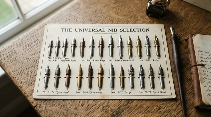
There’s a particular kind of chaos that happens on a calligrapher’s desk. A dip pen nib collection has a way of multiplying quietly — one Nikko G becomes three, then a Brause turns up in a birthday card, and suddenly you’re rummaging through a biscuit tin trying to remember which nib made that gorgeous Copperplate swash last Tuesday. A dip pen nib collection is simply a curated set of interchangeable metal nibs, ranging from stiff broad-edge styles to whisper-thin flex nibs, kept together so a calligrapher can match the right point to the right script without buying new tools every time a technique changes. If you’re only just getting your feet wet, welcome — this is the messy, ink-stained, deeply satisfying hobby you didn’t know you needed.
Calligraphy with a nibbed pen has a long documented history in Britain — the Victoria and Albert Museum’s collection even holds surviving lettering exercises by Edward Johnston, the calligrapher widely credited with reviving the craft in the early 1900s. This guide is built for a British audience shopping on amazon.co.uk, and it leans on real products from brands with genuine pedigree — Japanese manga-nib manufacturers, a German steelworks turned pen specialist, and a couple of proudly British firms that have been grinding nibs since the Victorian era. We’ll walk through seven nibs and box sets worth anchoring a collection around, unpack the eternal dip pen vs fountain pen for calligraphy debate, and get properly nerdy about what a flex nib actually does when you press down on a pointed pen mid-Copperplate script. No fluff, no invented reviews — just honest analysis grounded in real specs and genuine aggregated feedback from the calligraphy community.
Quick Comparison Table: Dip Pen Nibs at a Glance
Before we dig into the full write-ups, here’s a scannable snapshot of where each nib or set sits in a well-rounded collection.
| Nib / Set | Best Known For | Price Range |
|---|---|---|
| Nikko G Nib | Best all-rounder for beginners | Around £2-£4 per nib |
| Zebra G Nib | Firmer bite for heavier hands | Around £2-£4 per nib |
| Tachikawa G Nib | Longest ink hold in daily use | Around £3-£5 per nib |
| Manuscript Round Hand Nib Selection Box | Best value UK-made starter set | £10-£18 range |
| William Mitchell Round Hand Dip Pen Box Set | Best for broad-edge scripts | £15-£22 range |
| Leonardt EF Principal Nib | Most refined flex for Copperplate | Around £2-£4 per nib |
| Brause No. 66 “Arrow” Nib | Sharpest contrast for advanced work | Around £3-£6 per nib |
At a glance, the pattern is obvious: individual pointed-pen nibs cluster under a fiver, while the broad-edge box sets cost more upfront because you’re paying for ten graduated widths, a holder, and reservoirs in one box. If you’re assembling a first dip pen nib collection on a tight budget, start with two or three individual nibs rather than a full set — you’ll spend less finding out which flex level actually suits your hand before committing to a bigger box.
💬 Found a nib that changed your calligraphy? Just one click below to help other beginners find their perfect match too!😊
Top 7 Dip Pen Nibs: Expert Analysis for Building Your Collection
Every nib below earns its place for a different reason — some are the reliable workhorses every collection needs, others are the specialist tools you reach for once your hand has found its confidence. Here’s the full spec comparison before we get into the detail.
| Nib | Flex Level | Origin | Nib Style | Price Range |
|---|---|---|---|---|
| Nikko G Nib | Medium | Japan | Pointed pen | £2-£4 per nib |
| Zebra G Nib | Medium-firm | Japan | Pointed pen | £2-£4 per nib |
| Tachikawa G Nib | Medium | Japan | Pointed pen | £3-£5 per nib |
| Manuscript Round Hand Nib Selection Box | N/A (broad-edge) | UK | Broad-edge, 10 nibs | £10-£18 |
| William Mitchell Round Hand Dip Pen Box Set | N/A (broad-edge) | UK | Broad-edge, 10 nibs | £15-£22 |
| Leonardt EF Principal Nib | High | UK | Pointed pen | £2-£4 per nib |
| Brause No. 66 “Arrow” Nib | Very high | Germany | Pointed pen | £3-£6 per nib |
Reading across that table, a sensible starter collection would pair one of the top three Japanese nibs with a broad-edge box set, giving you both pointed-pen and edged-pen capability from day one. The two flex nibs at the bottom — Leonardt and Brause — are worth adding once your hand has developed enough control that ink spatter stops being a daily hazard, since both reward a light, confident touch rather than raw enthusiasm.
1. Nikko G Nib — best all-rounder for beginners
Originally engineered in Japan for manga illustrators rather than calligraphers, the Nikko G has become the default recommendation across the pointed-pen community almost by accident. Its chrome-plated tines offer a medium flex — enough spread on a downstroke to create real contrast, but forgiving enough that heavy-handed beginners won’t blow the tines apart on the first attempt. Based on the spec comparison against stiffer options, what stands out is the nib’s unusually generous ink capacity, which means fewer re-dips mid-word and more time spent actually practising your letterforms rather than fussing with your inkwell.
Reviewers consistently report that this is the nib they wish they’d started with, describing it as sturdy enough to handle a slightly wobbly upstroke without catching on the paper — a common frustration with finer nibs. What most buyers overlook is that the Nikko G’s medium flex is a genuine feature, not a compromise: it teaches proper pressure control before you graduate to more temperamental nibs, which is precisely why it’s built into most beginner calligraphy courses.
Pros:
- ✅ Exceptionally forgiving for first-time pointed pen users
- ✅ Holds a generous amount of ink between dips
- ✅ Works well with both drawing inks and calligraphy inks
Cons:
- ❌ Medium flex means less dramatic contrast than premium nibs
- ❌ Requires a fair bit of pressure for a heavy downstroke
Priced around £2-£4 for a single nib, this is about as low-risk an entry point as a dip pen nib collection gets — genuinely excellent value for the control it hands you early on.
2. Zebra G Nib — firmer bite for heavier hands
The Zebra G sits right next door to the Nikko G on the spec sheet, but the difference in feel is more noticeable than the numbers suggest. Where the Nikko G is famously tolerant, the Zebra G has a firmer, sharper point that rewards a lighter, more deliberate touch — on paper this means slightly finer hairlines and a point that some calligraphers describe as more “precise” under the nib.
What the spec sheet won’t tell you, but reviewers note, is that the Zebra G tends to suit people who found the Nikko G a bit too soft or bouncy once their pressure control improved. It’s frequently recommended as the natural “step two” nib rather than a starting point, because its firmness demands more consistency than an absolute beginner typically has yet. Aggregated feedback across calligraphy retailers consistently flags it as a favourite for long practice sessions, since the firmer tines resist fatigue-induced wobble better than softer alternatives.
Pros:
- ✅ Sharper, more precise point than the Nikko G
- ✅ Firm flex resists fatigue during long practice sessions
- ✅ Compatible with a wide range of calligraphy inks
Cons:
- ❌ Less forgiving for absolute beginners with heavy pressure
- ❌ Requires cleaner, lighter technique to show its best line
At around £2-£4 per nib, it’s a natural companion to the Nikko G in any growing collection rather than a replacement for it.
3. Tachikawa G Nib — longest ink hold in daily use
Tachikawa has been manufacturing metal dip pens in Japan since 1935, and the G Nib is its answer to the Nikko and Zebra — similar in spirit, but built to carry noticeably more ink per dip. Based on the spec comparison, that extra ink capacity is the standout practical difference: for longer writing sessions, such as addressing a stack of wedding envelopes, fewer interruptions to reload the nib genuinely speeds things up.
Here’s what to weigh: the Tachikawa G produces very fine upstrokes, which makes it a strong dual-purpose choice for calligraphers who also sketch or ink illustrations alongside their lettering practice. Reviewers consistently describe the flex as comparable to the Nikko G but slightly smoother in transition between thick and thin strokes, which is a subtle but real advantage once you’re chaining several letters together at speed. It’s a nib that rewards patience — the extra ink hold means less frequent dipping, but also a small learning curve in judging how much pressure produces a clean line before the reservoir runs dry.
Pros:
- ✅ Holds more ink than comparable G-style nibs
- ✅ Produces exceptionally fine, controlled upstrokes
- ✅ Doubles well as an illustration and drawing nib
Cons:
- ❌ Slightly pricier than the Nikko or Zebra equivalents
- ❌ Less widely stocked in UK craft shops than its rivals
Expect to pay around £3-£5 per nib — a small premium that’s easy to justify if you regularly write in long, uninterrupted sessions.
4. Manuscript Round Hand Nib Selection Box — best value UK-made starter set
Manuscript has been producing steel nibs from its base in Britain for well over a century, and this ten-nib Round Hand selection box is arguably the single best way to build the broad-edge side of a dip pen nib collection in one purchase. Based on the spec comparison, the set spans a genuinely wide range of widths, so you can move from bold, chunky Gothic strokes down to fine Italic detailing without buying a single extra nib.
What most buyers overlook about a box set like this is that it isn’t just about the nibs — you also get a wooden holder, an ink reservoir for longer writing stints, and a magnet purpose-built for lifting tiny nibs out of their case without dropping them behind the desk. Reviewers consistently describe the set as excellent value precisely because buying ten individual nibs plus a decent holder separately would cost noticeably more. It’s a smart first purchase for anyone drawn to traditional broad-edge hands — Uncial, Gothic, Roman, Italic — rather than the pointed-pen styles the earlier nibs on this list specialise in.
Pros:
- ✅ Ten graduated widths cover almost every broad-edge script
- ✅ Includes holder, reservoir, and nib-handling magnet
- ✅ Manufactured in Britain with a protective anti-tarnish coating
Cons:
- ❌ Not suited to pointed pen or Copperplate-style work
- ❌ Wider nibs need practice before lines stay consistent
Typically priced in the £10-£18 range, this is genuinely one of the best-value entry points into broad-edge calligraphy on the whole UK market.
5. William Mitchell Round Hand Dip Pen Box Set — best for broad-edge scripts
William Mitchell’s Round Hand set is the classic alternative to the Manuscript box, and the two are often compared directly by UK calligraphy retailers because they solve the same problem in slightly different ways. This set also includes ten nibs with a fine graduation of widths, alongside two slip-on reservoirs, a multipurpose holder, and a magnet, all housed in a hard plastic box that doubles as long-term storage.
Based on the spec comparison, the main practical difference from the Manuscript set is the storage case — a rigid plastic box rather than a tin, which some collectors prefer for stacking on a shelf. Reviewers consistently note that the nibs themselves feel slightly different in hand, with a touch more resistance on the widest sizes, which some calligraphers find helps with control on bold Gothic downstrokes. What the spec sheet won’t tell you is that many serious hobbyists end up owning both sets over time, simply because subtle differences in steel temper between manufacturers mean one brand’s medium nib might suit your grip better than the other’s identical-looking equivalent.
Pros:
- ✅ Hard plastic case doubles as durable long-term storage
- ✅ Fine graduation across ten nib widths in one box
- ✅ Suitable for Uncial, Gothic, Roman, and Italic hands
Cons:
- ❌ Similar price point to Manuscript with largely overlapping use
- ❌ Bulkier storage case than a simple tin
At around £15-£22, it sits slightly above the Manuscript set, and the choice between the two often comes down to which storage case you’d rather have on your desk.
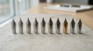
6. Leonardt EF Principal Nib — most refined flex for Copperplate purists
D. Leonardt & Co has been grinding pen nibs in England since the mid-19th century, and the EF Principal is a modern nib deliberately modelled on the old Principality No.1 — a nib so sought-after among vintage collectors that genuine originals are now scarce. Based on the spec comparison, the EF Principal delivers extra-fine hairlines with a flex that sits firmly in “advanced” territory, producing the kind of dramatic thick-thin contrast that defines classic Copperplate script.
Here’s what to weigh before buying: this is not a nib for someone who picked up a dip pen last week. Reviewers consistently note that its flexibility, while beautiful in the right hands, punishes inconsistent pressure with ink blots and uneven hairlines. What most buyers overlook is that the EF Principal rewards patience with ink flow specifically — because the tines are so fine, getting the ink started sometimes takes an extra dip or a gentle touch to the paper before the line begins cleanly. Once mastered, though, it’s frequently cited by experienced calligraphers as one of the closest modern equivalents to genuinely vintage Victorian nibs.
Pros:
- ✅ Dramatic, historically accurate thick-thin contrast
- ✅ Based directly on a celebrated vintage nib design
- ✅ Manufactured in England with a long pedigree
Cons:
- ❌ Steep learning curve unsuitable for absolute beginners
- ❌ Fine tines can catch on textured or fibrous paper
Priced around £2-£4 per nib, it’s affordable enough to try once your pointed-pen fundamentals are solid, and it’s a strong pick for anyone chasing an authentic Copperplate script look.
7. Brause No. 66 “Arrow” Nib — sharpest contrast for advanced work
Brause traces its roots back to 1850s Iserlohn in Germany, a town once famous for steel needle-making, and its journey from bicycle spokes to pen nibs in 1895 is one of the more charming footnotes in stationery history. The EF66, nicknamed the “Arrow” for its shape, is widely regarded as Brause’s flagship nib — small, flexible, and capable of the kind of stroke contrast that makes finished Copperplate and modern calligraphy pieces look genuinely professional.
Based on the spec comparison against the Leonardt EF Principal, the EF66 is generally considered slightly more forgiving of imperfect technique, with sturdier tines that resist catching on paper fibres even though the flex itself is comparably dramatic. Reviewers consistently describe it as their favourite “everyday” advanced nib — used for almost everything once a calligrapher has moved past the beginner stage. What the spec sheet won’t tell you is that initiating ink flow can be fiddly at first; many experienced users recommend a quick dip in warm water or a specialist nib-prep solution before first use to strip the factory coating and get ink moving smoothly.
Pros:
- ✅ Exceptional stroke contrast for finished calligraphy pieces
- ✅ Sturdier tines than comparably flexible rivals
- ✅ Long manufacturing pedigree from a specialist German steelworks
Cons:
- ❌ Not recommended as a first nib for beginners
- ❌ Can be fiddly to prime with ink straight out of the packet
Expect to pay around £3-£6 per nib — a reasonable premium for what many calligraphers consider the gold standard of flexible pointed pen nibs.
Setting Up and Caring for Your Dip Pen Nib Collection
A brand-new nib almost never writes well straight out of the packet, and that catches a lot of newcomers off guard. Manufacturers coat nibs in a light film of oil or lacquer to prevent rust during shipping and storage, and that coating actively repels ink. Before first use, wipe the nib with a little washing-up liquid on a soft cloth, or hold it briefly in a flame from a match (carefully, and only for a second) to burn off the coating — both methods are widely used across the calligraphy community.
Once a nib is inked and working, rinse it under lukewarm water after every session and dry it thoroughly before storing it, ideally nib-down in a small pot so residual ink doesn’t creep back up into the vent hole and dry there. A soft toothbrush works well for stubborn dried ink in the crevice near the tines. Iron gall and pigmented inks are more corrosive than dye-based calligraphy inks, so nibs used regularly with them tend to need replacing sooner — this is completely normal and not a sign you’ve bought a faulty nib. Most dedicated calligraphers keep a small stock of spares of their favourite nib for exactly this reason, since even a well-cared-for nib eventually loses its crisp point after enough use.
Storage matters more than most beginners expect. A dip pen nib collection left loose in a drawer will develop rust spots within weeks in a damp room, so a lined tin, a magnetic nib case, or simply the original packaging kept somewhere dry will noticeably extend each nib’s working life.
✨ Don’t Miss These Exclusive Deals!
🔍 Take your dip pen nib collection to the next level with these carefully selected products. Click on any highlighted item to check current pricing and availability. These tools will help you create authentic, gallery-worthy calligraphy your family will love!
Which Nib Suits Your Calligraphy Journey? Three Real-World Scenarios
If you’re a complete beginner who’s never touched a pointed pen before, start with the Nikko G Nib and a bottle of forgiving, dye-based calligraphy ink. Budget around £15-£20 total including a holder, and give yourself several weeks of drills — ovals, upstrokes, downstrokes — before worrying about actual letterforms. The medium flex means early mistakes won’t feel catastrophic, which matters enormously for staying motivated in those frustrating first few sessions.
If you’re a modern calligraphy hobbyist who’s outgrown a beginner set and wants more expressive contrast for Instagram-style lettering or wedding place cards, the Brause No. 66 “Arrow” Nib paired with your existing holder is a natural next step. At this stage you likely already know how to manage pressure reasonably well, and the jump in flex will feel like a genuine creative upgrade rather than a frustrating regression. Budget for a few nibs at once, since flex nibs wear faster under regular use for decorative work.
If you’re a dedicated student working specifically towards traditional Copperplate or Spencerian script — perhaps following a structured course or preparing for a calligraphy exhibition — building out a fuller collection around the Leonardt EF Principal Nib, several Zebra Gs for practice drills, and one of the broad-edge box sets for versatility makes the most sense. This tier of hobbyist typically spends more time researching historical hands and benefits from having several nib personalities on hand to match different scripts and moods.
Common Dip Pen Nib Problems and How to Solve Them
Ink won’t flow from a new nib. This is almost always the factory coating problem described above — clean the nib with washing-up liquid or a quick flame-pass before your first dip, and it should flow normally afterwards.
The nib catches or scratches on the paper. Fine, flexible nibs like the Leonardt EF Principal and Brause No. 66 are sensitive to paper texture. Switching to a smooth, low-fibre paper such as HP printer paper or a dedicated calligraphy pad usually solves this instantly.
Ink blots appear on downstrokes. This usually signals too much pressure too quickly on a flexible nib. Slowing down and easing into pressure gradually — rather than pressing hard immediately — gives the tines time to spread evenly instead of flooding with ink.
Rust spots appearing on stored nibs. Nibs left damp or exposed to humid air will corrode, particularly if used with iron gall ink. Dry nibs thoroughly after every session and store them somewhere dry, ideally in a sealed tin with a silica gel sachet.
Inconsistent line width across a script. This is frequently a sign the nib itself has worn out rather than a technique problem. Nibs are consumable by design, and swapping in a fresh one from your collection is often the fastest fix.
How to Choose Dip Pen Nibs for Your Collection
- Identify your target script first. Broad-edge hands like Italic and Gothic need entirely different nibs from pointed-pen scripts like Copperplate — buying the wrong category is the single most common beginner mistake.
- Start with medium flex, not extreme flex. A nib like the Nikko G teaches pressure control gradually, whereas jumping straight to a Brause or Leonardt often leads to frustration and premature abandonment of the hobby.
- Buy nibs in twos or threes, not singles. Nibs are consumable, and having a spare on hand means a mid-project failure doesn’t derail an afternoon’s work.
- Match ink type to nib material. Chrome-plated nibs generally tolerate a wider range of inks than uncoated steel, which matters if you plan to experiment with pigmented or metallic inks.
- Consider a box set for broad-edge variety. If you’re drawn to traditional calligraphy hands rather than modern pointed-pen styles, a ten-nib set like the Manuscript or William Mitchell box delivers far better value than buying individual widths separately.
- Factor in holder compatibility. Most nibs fit universal-insert holders, but some ultra-fine nibs (like certain crow quill styles) need a dedicated holder — always check before buying.
- Don’t ignore UK-made options. Brands like Manuscript and Leonardt carry genuine manufacturing heritage, and supporting that supply chain often means better quality control on smaller batch runs.
Dip Pen vs Fountain Pen for Calligraphy
This is one of the most searched comparisons among newcomers, and it’s worth settling early because it shapes which tools you actually need to buy.
| Feature | Dip Pen Nibs | Fountain Pen Nibs |
|---|---|---|
| Ink compatibility | Pigmented, iron gall, acrylic inks | Water-based inks only (mostly) |
| Line variation | Extreme, pressure-controlled | Limited, fixed nib width |
| Nib replacement cost | Low — a few pounds per nib | Higher — often built into the pen |
| Maintenance | Rinse after every session | Periodic flushing required |
| Best suited to | Copperplate, Spencerian, broad-edge hands | Everyday writing, modern calligraphy on the go |
According to Wikipedia’s overview of the dip pen, these tools emerged in the early 19th century as a replacement for quills, and their defining advantage over fountain pens remains ink compatibility — a dip pen nib collection can happily use pigmented, waterproof, or iron gall inks that would permanently clog or corrode most fountain pens. Based on the comparison above, the trade-off is convenience: a fountain pen never needs re-dipping, but it simply can’t produce the dramatic thick-thin contrast that defines Copperplate script, because its nib width is fixed rather than pressure-responsive. For anyone serious about pointed-pen or broad-edge calligraphy specifically, a dip pen nib collection isn’t really optional — it’s the only tool that physically produces the effect.
Flex Nibs Explained: What “Flex” Actually Means on Paper
The word “flex” gets thrown around loosely in calligraphy shops, so it’s worth being precise. A flex nib has two tines that separate under downward pressure, letting more ink flow and creating a wider line, then spring back together on the upstroke to produce a hairline. The degree of flex — how far the tines splay and how much pressure that takes — is what separates a forgiving nib like the Nikko G from a demanding one like the Brause No. 66.
What most buyers overlook is that more flex isn’t automatically “better.” A highly flexible nib in inexperienced hands produces inconsistent, blotchy lines, while a medium-flex nib in the same hands produces clean, controlled ones. Based on the spec comparison across this list, the general progression most calligraphers follow is medium flex (Nikko G, Zebra G, Tachikawa G) to build fundamentals, then high flex (Leonardt EF Principal) or very high flex (Brause No. 66) once pressure control feels second nature. Reviewers consistently describe jumping straight to the flexiest nib available as the fastest route to abandoning the hobby in frustration — patience with flex level pays off far more than patience with anything else in calligraphy.
Pointed Pen vs Broad-Edge Nibs: Choosing Your Script
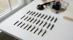
Pointed pen nibs — the Nikko G, Zebra G, Tachikawa G, Leonardt EF Principal, and Brause No. 66 on this list — have a single sharp tip that splits into two tines under pressure. They’re the tools behind Copperplate, Spencerian, and modern calligraphy, where line width changes constantly within a single letter based on how hard you press.
Broad-edge nibs, like those in the Manuscript and William Mitchell box sets, work completely differently. Their flat, chisel-shaped tip produces a fixed line width determined by the angle you hold the pen at, not by pressure. This is the tool behind Italic, Gothic, Uncial, and Roman hands — scripts where consistency of stroke width, not dramatic variation, is the goal. What most buyers overlook is that these two categories aren’t interchangeable, and a beginner who buys a broad-edge set expecting Copperplate-style contrast will be disappointed within the first afternoon. If you’re not sure which style appeals to you, it’s genuinely worth watching a few short demonstration videos of each script before committing your budget — the visual difference between the two families is dramatic and will make the decision obvious almost immediately.
Copperplate Script: Which Nibs in Your Collection Work Best
Copperplate is arguably the script that made pointed-pen nib collecting a hobby in its own right, and it demands specific qualities from a nib that broad-edge scripts simply don’t require. The defining feature of Copperplate is its extreme contrast between hairline upstrokes and shaded, swollen downstrokes, all produced at a consistent 55-degree slant.
Based on the spec comparison, the Leonardt EF Principal Nib and Brause No. 66 “Arrow” Nib are the two strongest choices on this list specifically for Copperplate, because their high flex produces the dramatic shading the script is known for. The Nikko G Nib and Zebra G Nib can absolutely be used to learn Copperplate letterforms and drills, but the contrast will be visibly more subtle — which is actually an advantage while you’re still learning the underlying shapes, since it forgives uneven pressure. Reviewers consistently note that serious Copperplate students tend to own both tiers: a medium-flex nib for daily drills and a high-flex nib reserved for finished pieces once the letterforms are second nature.
Long-Term Cost & Maintenance: Is a Nib Collection Worth It?
Individual pointed-pen nibs are genuinely cheap in isolation — typically £2-£6 each — but a working calligrapher can go through a surprising number over a year, particularly with flexible nibs used regularly for finished pieces. A realistic estimate for a moderately active hobbyist is somewhere between £20 and £40 a year on replacement nibs, which is negligible compared to most other creative hobbies once you account for how long a single nib lasts under normal, well-maintained use.
| Nib Type | Typical Lifespan (regular use) | Approx. Annual Cost |
|---|---|---|
| Medium-flex pointed nib (e.g. Nikko G) | 3-6 months | £8-£16 |
| High-flex pointed nib (e.g. Brause No. 66) | 1-3 months | £12-£24 |
| Broad-edge box set nib | 6-12 months | £2-£6 |
Looking at the table above, broad-edge nibs from box sets like the Manuscript Round Hand Nib Selection Box last considerably longer per nib than flexible pointed-pen nibs, simply because they endure less tine-spreading stress with every stroke. The real long-term value of any dip pen nib collection isn’t the individual nib cost — it’s that a £15 box set or a handful of £3 nibs can produce years of practice, unlike disposable felt-tip calligraphy pens that dry out and get binned within weeks regardless of how well you look after them.
Safety, Ink and Storage: Building a Collection That Lasts
Most modern calligraphy inks are non-toxic and safe for home use, but a few older or specialist pigmented inks — particularly traditional iron gall recipes — can stain skin, fabric and worktops permanently, so it’s worth working over a covered surface and keeping inks away from young children regardless of the label. According to The National Archives’ own conservation research, iron gall ink has been used since antiquity precisely because of its rich, permanent colour, but that same chemistry that makes it archival-quality on paper is also what corrodes untreated steel nibs over time if they’re left wet.
For a growing dip pen nib collection, the practical takeaway is straightforward: rinse nibs promptly after any session involving pigmented or iron gall ink, store the collection somewhere genuinely dry rather than a damp bathroom cabinet, and consider a small silica gel sachet in your storage tin if you live somewhere prone to condensation. None of this is complicated, but skipping it is the single most common reason a promising nib collection quietly rusts into uselessness within a year.
Frequently Asked Questions
❓ What's the difference between a dip pen nib collection and a calligraphy set?
❓ How many nibs do I need to start a dip pen nib collection?
❓ Can I use a dip pen nib collection with fountain pen ink?
❓ Which nib is best for Copperplate script beginners?
❓ How do I stop my dip pen nibs from rusting?
Conclusion
Building a proper dip pen nib collection isn’t about buying every nib on the market — it’s about understanding what each one actually does differently, then assembling a small, purposeful set that covers the scripts you genuinely want to write. Start with something forgiving like the Nikko G Nib, add a broad-edge box set from Manuscript or William Mitchell if traditional hands appeal to you, and only reach for the Leonardt EF Principal or Brause No. 66 once your pressure control feels genuinely confident rather than lucky.
None of the seven nibs and sets covered here are expensive in isolation, and that’s rather the point — this is a hobby where a modest £20-£30 outlay buys you months of practice, a genuinely wide range of scripts to explore, and the particular quiet satisfaction of watching a hairline upstroke and a shaded downstroke emerge from the exact same nib. Whichever combination you choose, the long tradition of calligraphy this hobby sits within is a forgiving one — every calligrapher’s early attempts look rough, and every collection starts with a single, slightly nervous first nib.
Recommended for You
- Dip Pen Sets for Beginners: 7 Best Starter Kits UK (2026)
- Brush Pens Under £15: 7 Best Picks for UK Beginners (2026)
- 7 Best Brush Pens for Manga Art in 2026 (Honest Picks)
Disclaimer: This article contains affiliate links. As an Amazon Associate, I earn from qualifying purchases. If you purchase products through these links, we may earn a small commission at no additional cost to you.
✨ Found this helpful? Share it with your friends! 💬🤗
